Brand Guide

NVNM Chain

This guide lays out the essential design standards that bring NVNM Chain’s brand to life. No matter your role or area of expertise, this guide gives you the tools to shape a clear and consistent brand experience in which every touchpoint reflects the trust and efficiency at the heart of NVNM Chain.

Messaging

How we describe NVNM Chain should not only resonate strongly with our audience—more importantly, it should be communicated consistently. The more unified and consistent our response to what NVNM Chain does, the more trusted we become by our audience.

Messaging

Principles

Keep it simple

Only use: NVNM ChainDo not use: NVNM, Inveniam Chain, nvnm chain, NVNM CHAIN

Capitalization ≠ engagement

In general, follow the Purdue OWL guidelines for using capitals.

Include everyone

Avoid financial and technical jargon and abbreviations. If they are needed, explain in full upon first use.

The eye is a stomach

It can get full. Keep writing short, concise and light.

Messaging

Taglines

Correct

Accountability infrastructure for agentic activity

Avoid

Accountability infrastructure for the agentic economy

Agentic accountability infrastructure

Messaging

Key messages

NVNM Chain is a shared, tamper-proof record that lets one company prove to another exactly what data it had, and when, without ever showing the data itself.

NVNM Chain is bidding to be the common standard for how companies prove the data they hand each other is genuine. Private-market deals first, then any place one party has to trust another party's data.

As companies hand more work to AI, NVNM Chain is the neutral ledger that records what each system was given and what it produced, so the other side can verify it instead of taking it on faith.

Logo

NVNM Chain is a business unit created by its parent company Inveniam. The wave mark is derived from Inveniam’s logo, linking NVNM Chain directly to the Inveniam family.
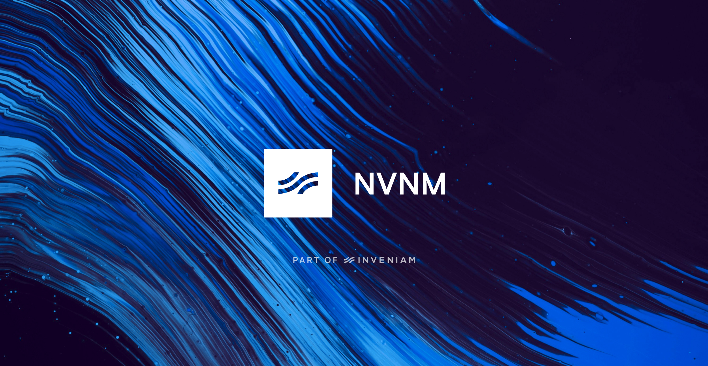
Image of brand logo incorrectly sized

Logo

Versions

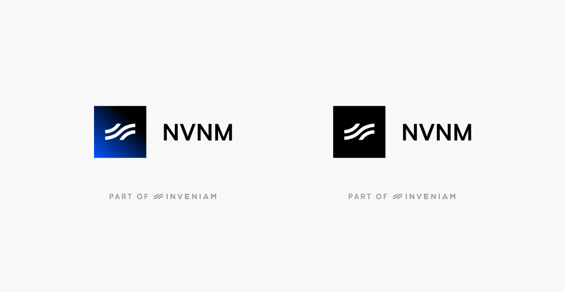
Never use the mark by itself, unless for very restricted areas, and always in context of an NVNM Chain branded environment i.e. favicon for marketing website or avatar for social media profile.

We us our partner line ‘Part of Inveniam’ as much as we can. We omit it if legibility becomes an issue.
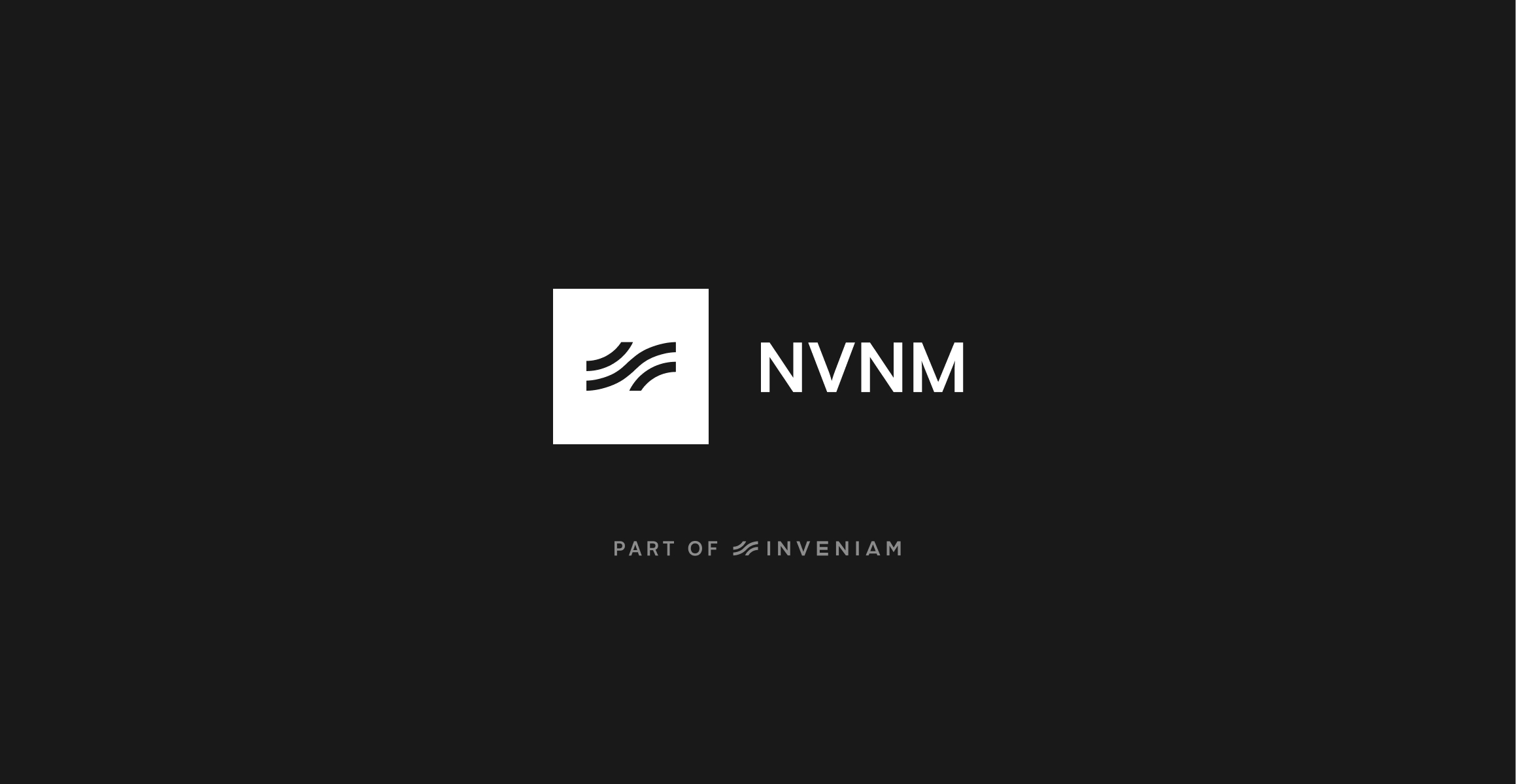
Image of brand logo incorrectly sized

mark

Image of brand logo incorrectly rotated

secondary

Logo

Color

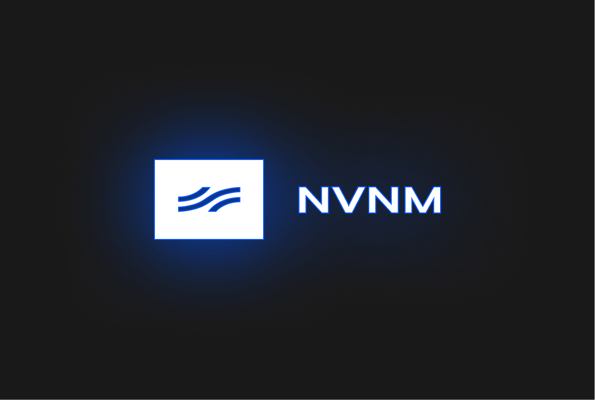
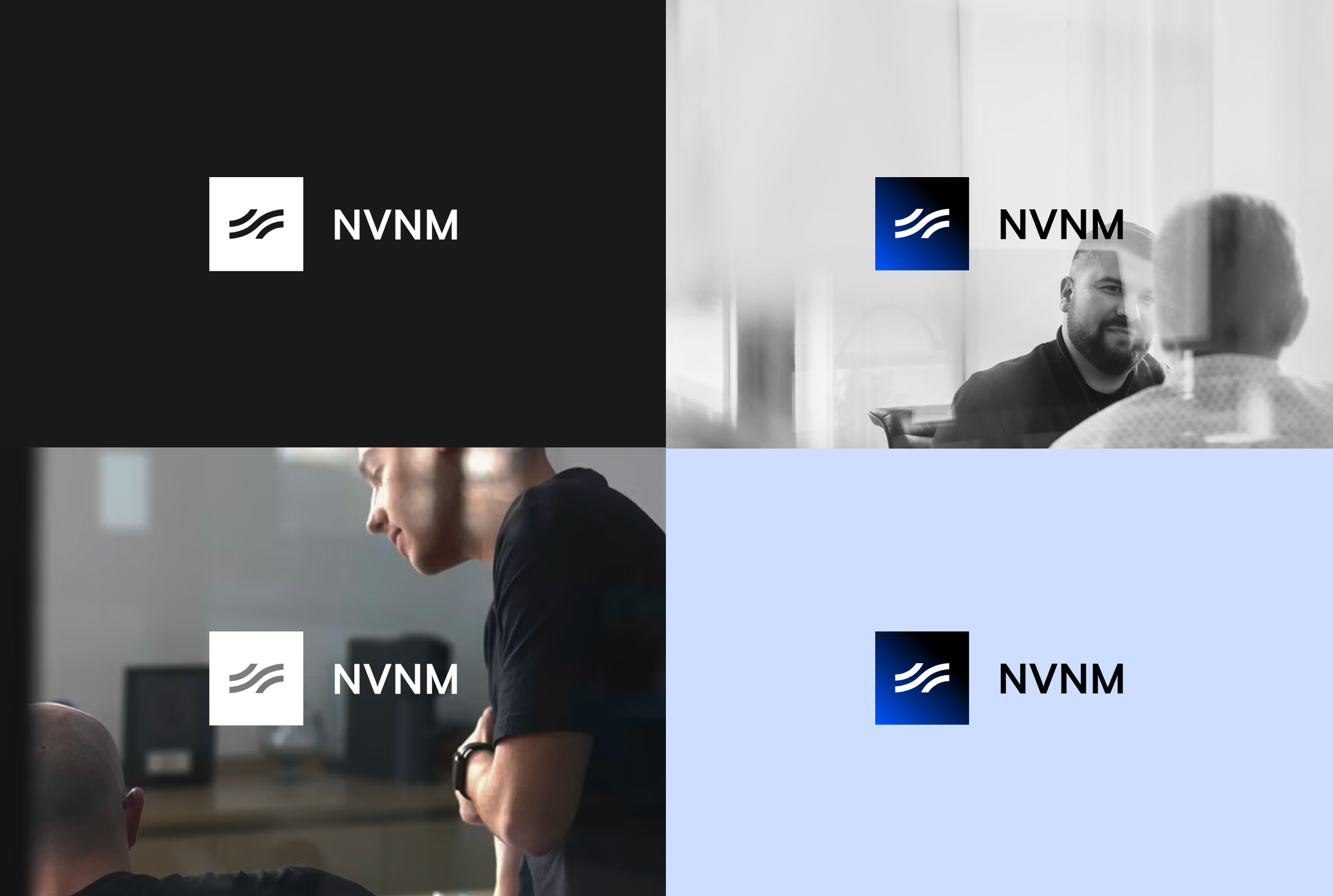
There is a choice of 2: primary (white) or secondary (black with a blue glow).

As NVNM Chain is a dark brand, we prefer to use the white version as much as possible.

Overall, contrast is key when deciding on logo color use: logos must stand out against the backdrop.
Logo

Partnerships

Ideally, we’d only use the white version of our logo and the partner’s logo when visualizing a partnership.

If the partner’s branding demands a full colour logo, we use our logo in secondary color.

Size-wise, both logos should appear the same size optically.
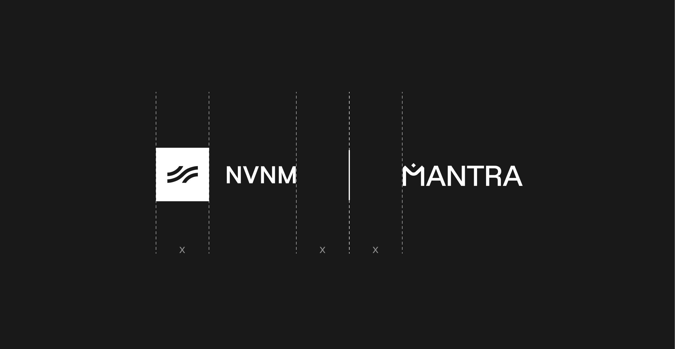
Image of brand logo incorrectly colored

Logo

Incorrect Usage

To ensure we build the best relationship with our audiences, consistency is key. Not only in what we say, but also how we present ourselves visually. Simply follow the guidelines and you can’t go wrong.

Orange gradient with shades of blue

🚫 Don’t use multiple colors

Blue gradient with shades of orange

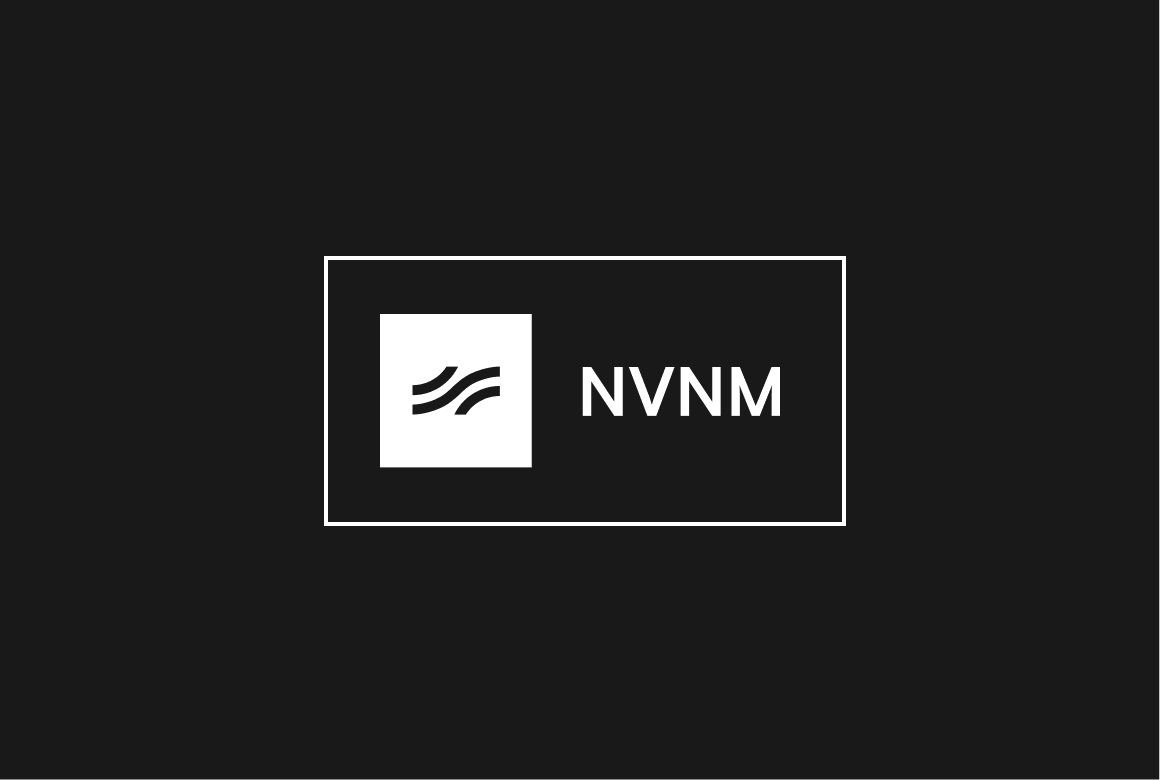
🚫 Don’t stack elements

Gradient with shades of orange

🚫 Don’t use framing

Gradient with shades of blue

🚫 Don’t distort/add effects

Color

NVNM Chain’s color palette reflects the interconnected undercurrents that ensure data flows in the right direction at the right pace. Primary blue is derived from the parent company brand palette. The Inveniam brand is bright and light, whereas NVNM Chain sits deeper and is therefore darker in color.

Logo

Palette

Shades of primary blue enables us to create layered imagery, representing streams and flows.

Primary Blue

#0055ff

Black

#000000

Light Blue

#5f94ff

Navy

#001a50

Typography

Image of brand logo incorrectly sized

Typography

Primary typeface

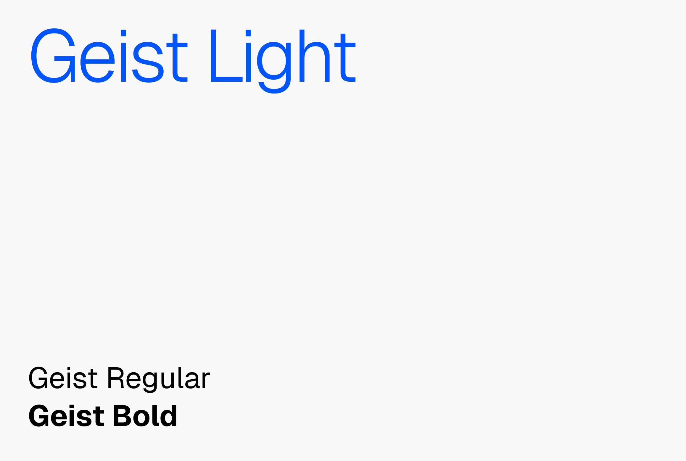
Geist embodies the design principles of simplicity, minimalism, and speed, drawing inspiration from the renowned Swiss design movement. With precision, clarity, and functionality at its core, Geist enhances the visual experience of developers and designers alike.

Typography

Fallback font

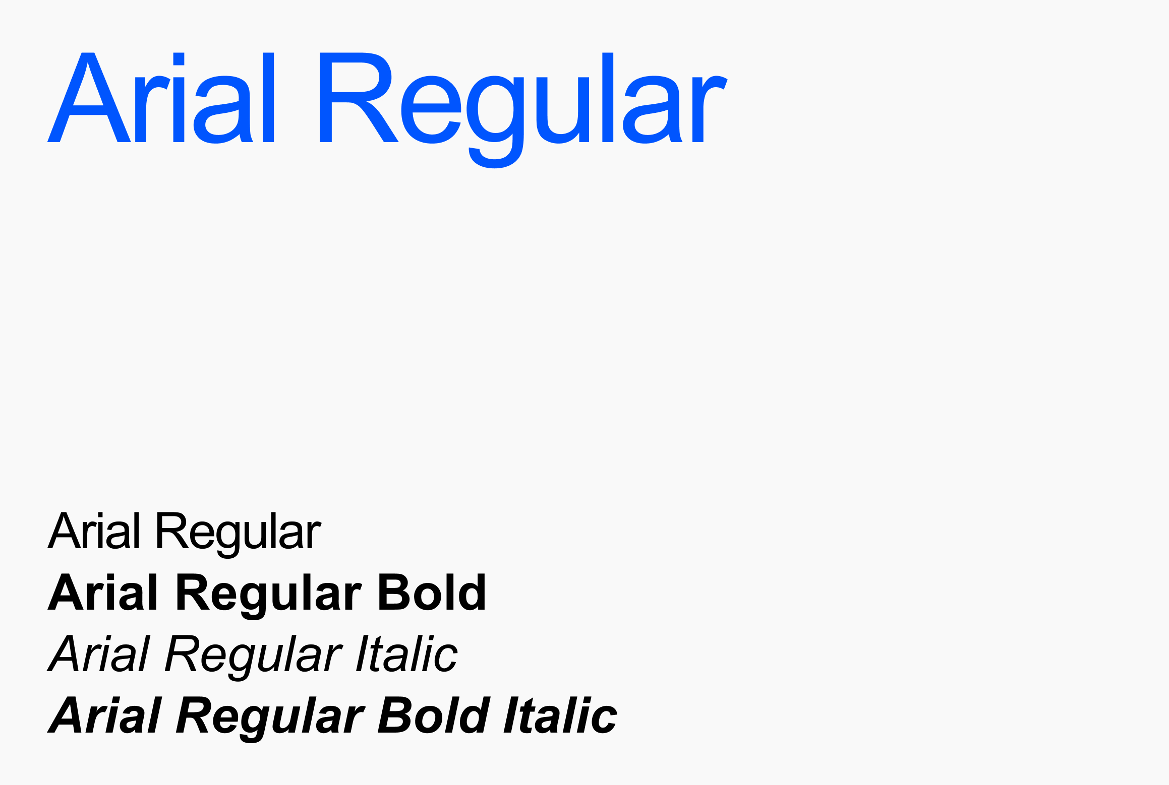
In some cases, we can not use our primary typeface. For example, collaborative workfiles will not show our primary typeface, unless all parties have that font installed. In those cases it is best to revert to a fallback font. For Inveniam, that would be Arial.

Imagery

Inveniam is the parent company which houses several different sub brands. The visual branding of these sub brands is always linked to the parent brand through the use of the framed mark, as well as the parent line underneath.

Imagery

Featured imagery

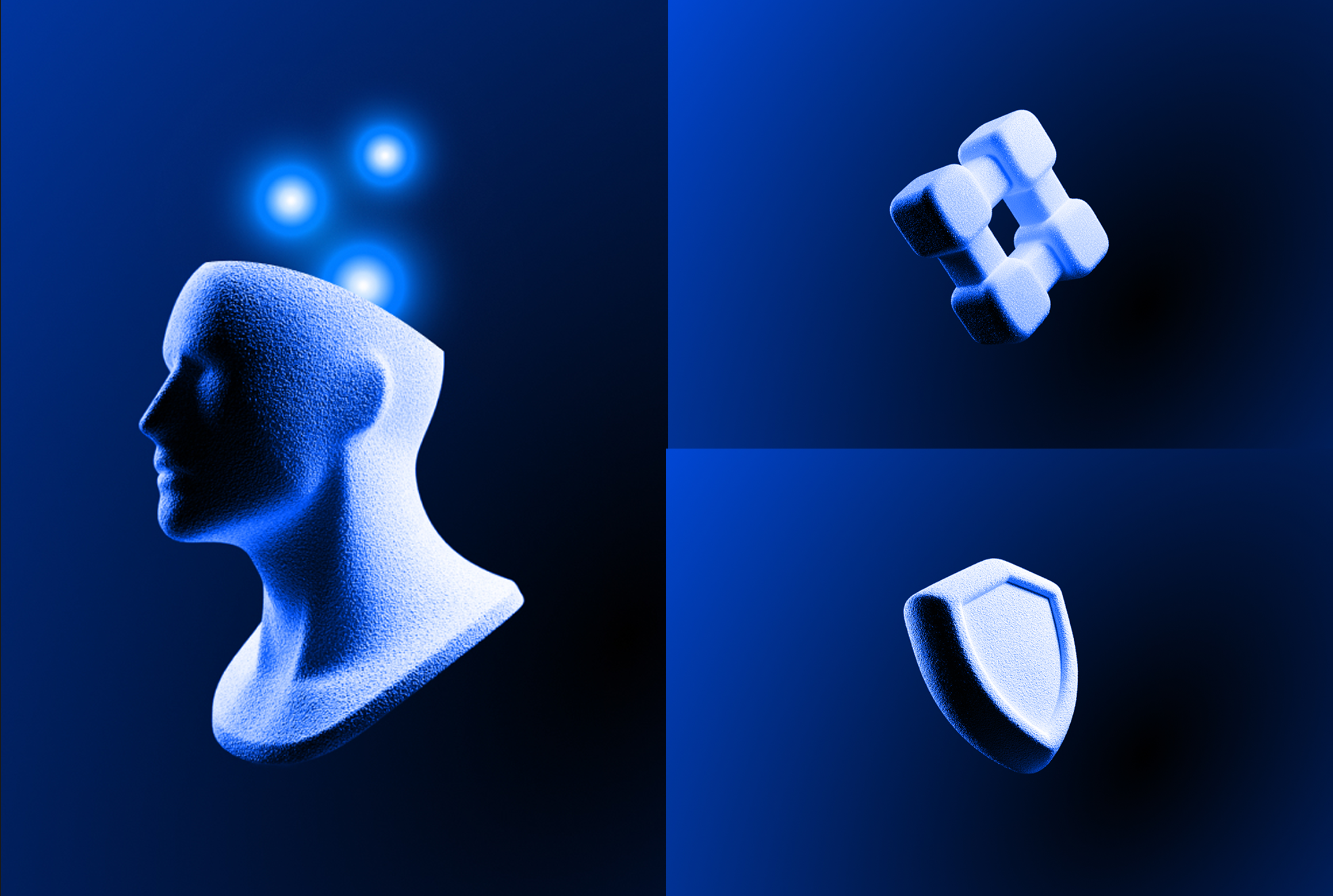
NVNM Chain’s brand images are AI-generated representations of digital sculptures. To create new images, we use these example images plus this prompt: Simple 3D object representing [...], floating mid-air against a black background. The object is white and the texture is smooth.

Imagery

Backdrops

The backdrops should always represent digital activity, streams or flows. We apply a layer of our primary blue on top to ensure it has the right hue of blue.

Orange gradient with shades of blue
Blue gradient with shades of orange
Gradient with shades of orange
Gradient with shades of blue

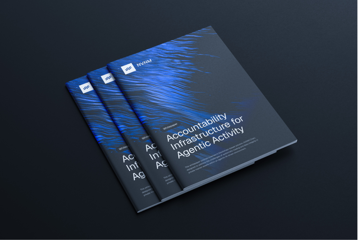
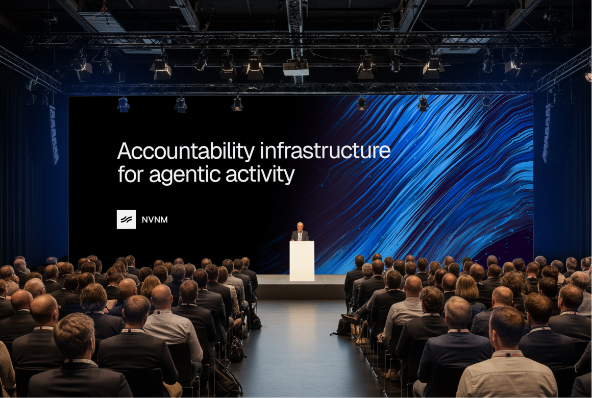
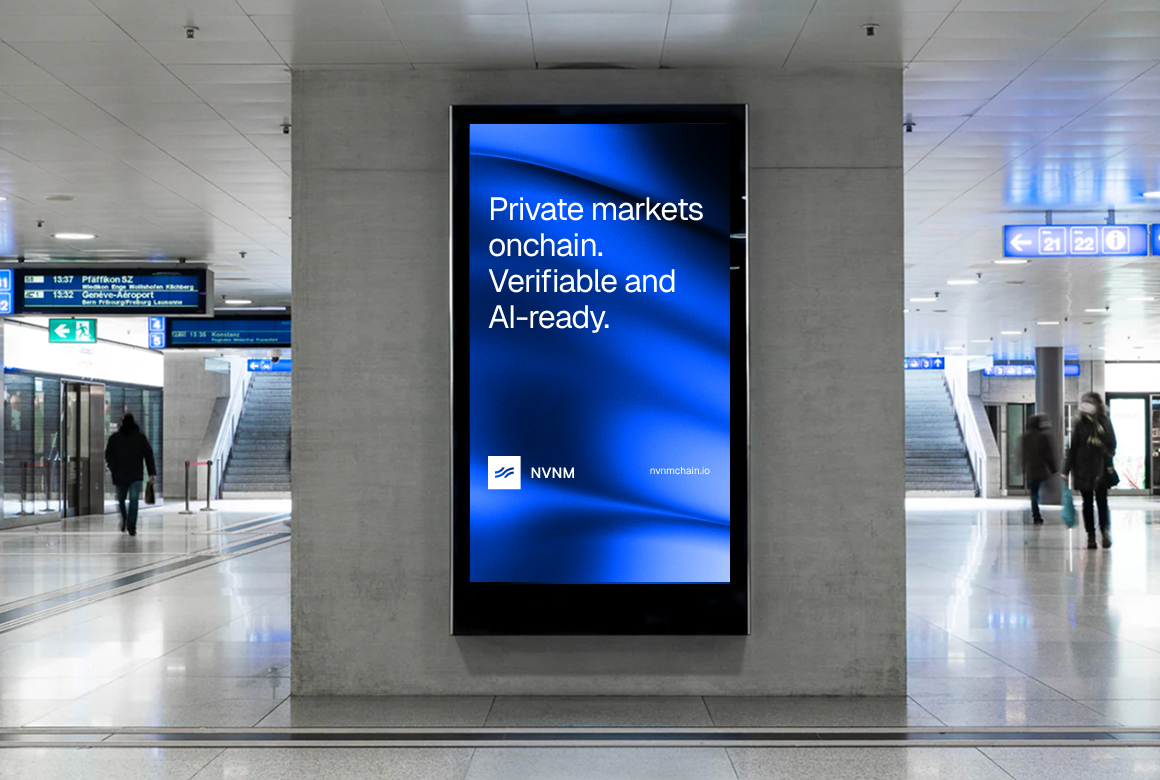
In use

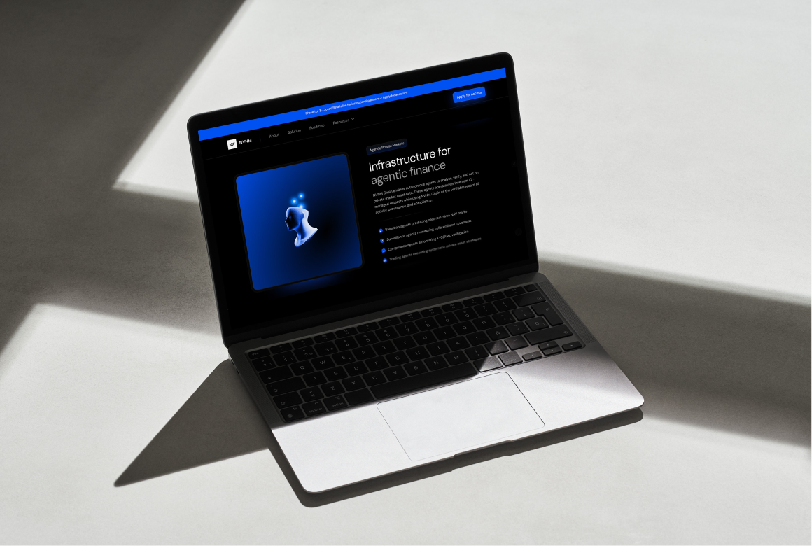
Person sitting on floor working on laptop
Person sitting by window working on tablet
Person sitting on couch working on laptop
Person at standing desk working on laptop
Person sitting on couch working on laptop
Person at standing desk working on laptop

© NVNM Chain

All rights reserved

Brand Guide

NVNM Chain

This guide lays out the essential design standards that bring NVNM Chain’s brand to life. No matter your role or area of expertise, this guide gives you the tools to shape a clear and consistent brand experience in which every touchpoint reflects the trust and efficiency at the heart of NVNM Chain.

Messaging

How we describe NVNM Chain should not only resonate strongly with our audience—more importantly, it should be communicated consistently. The more unified and consistent our response to what NVNM Chain does, the more trusted we become by our audience.

Messaging

Principles

Keep it simple

Only use: NVNM ChainDo not use: NVNM, Inveniam Chain, nvnm chain, NVNM CHAIN

Capitalization ≠ engagement

In general, follow the Purdue OWL guidelines for using capitals.

Include everyone

Avoid financial and technical jargon and abbreviations. If they are needed, explain in full upon first use.

The eye is a stomach

It can get full. Keep writing short, concise and light.

Messaging

Taglines

Correct

Accountability infrastructure for agentic activity

Avoid

Accountability infrastructure for the agentic economy

Agentic accountability infrastructure

Messaging

Key messages

NVNM Chain is a shared, tamper-proof record that lets one company prove to another exactly what data it had, and when, without ever showing the data itself.

NVNM Chain is bidding to be the common standard for how companies prove the data they hand each other is genuine. Private-market deals first, then any place one party has to trust another party's data.

As companies hand more work to AI, NVNM Chain is the neutral ledger that records what each system was given and what it produced, so the other side can verify it instead of taking it on faith.

Logo

NVNM Chain is a business unit created by its parent company Inveniam. The wave mark is derived from Inveniam’s logo, linking NVNM Chain directly to the Inveniam family.

Image of brand logo incorrectly sized

Logo

Versions

Never use the mark by itself, unless for very restricted areas, and always in context of an NVNM Chain branded environment i.e. favicon for marketing website or avatar for social media profile.

We us our partner line ‘Part of Inveniam’ as much as we can. We omit it if legibility becomes an issue.

Image of brand logo incorrectly sized

mark

Image of brand logo incorrectly rotated

secondary

Color

Color

There is a choice of 2: primary (white) or secondary (black with a blue glow).

As NVNM Chain is a dark brand, we prefer to use the white version as much as possible.

Overall, contrast is key when deciding on logo color use: logos must stand out against the backdrop.

Logo

Partnerships

Ideally, we’d only use the white version of our logo and the partner’s logo when visualizing a partnership.

If the partner’s branding demands a full colour logo, we use our logo in secondary color.

Size-wise, both logos should appear the same size optically.
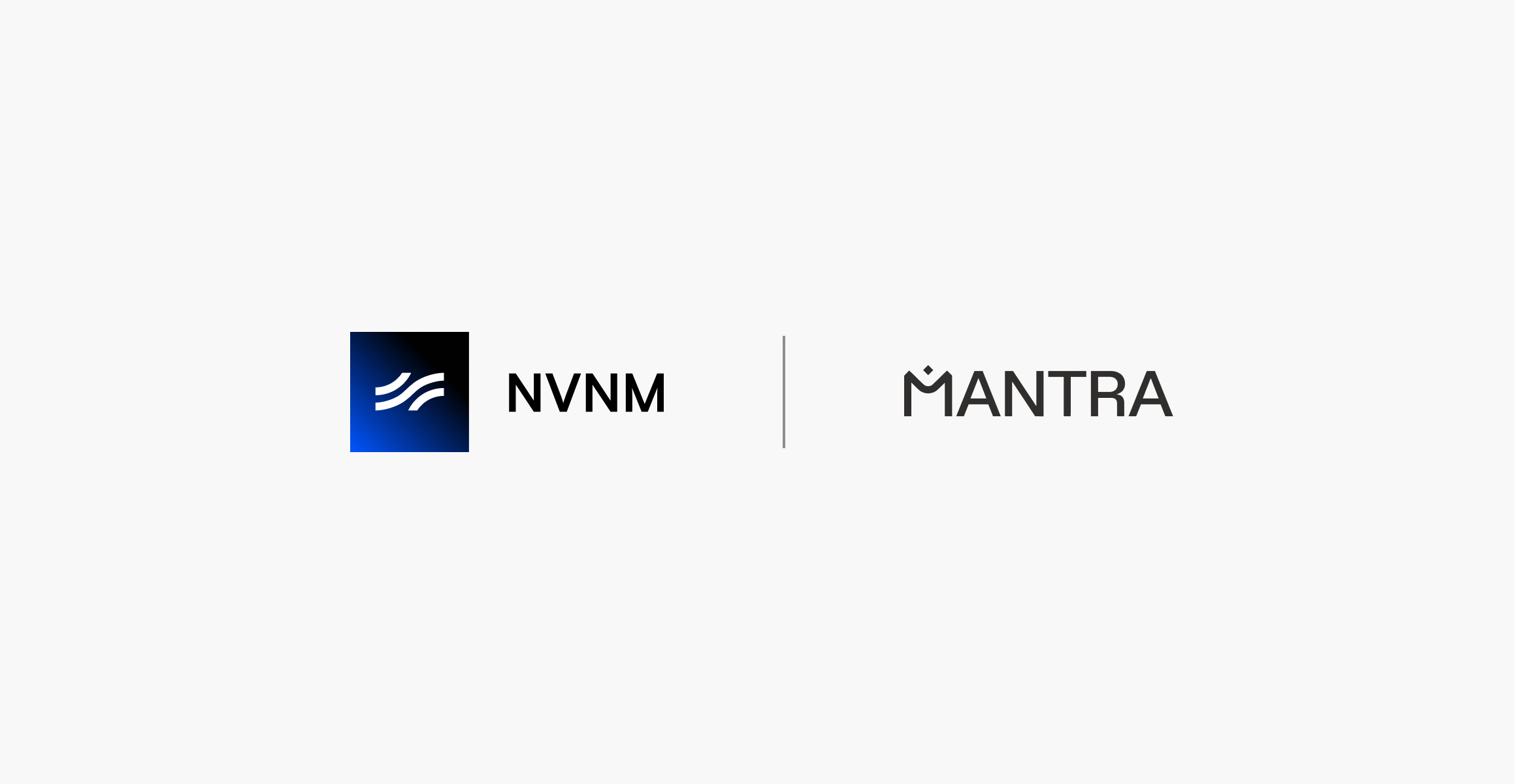
Image of brand logo incorrectly colored

Logo

Incorrect Usage

To ensure we build the best relationship with our audiences, consistency is key. Not only in what we say, but also how we present ourselves visually. Simply follow the guidelines and you can’t go wrong.
Orange gradient with shades of blue

🚫 Don’t use multiple colors

Blue gradient with shades of orange

🚫 Don’t stack elements

Gradient with shades of orange

🚫 Don’t use framing

Gradient with shades of blue

🚫 Don’t distort/add effects

Color

NVNM Chain’s color palette reflects the interconnected undercurrents that ensure data flows in the right direction at the right pace. Primary blue is derived from the parent company brand palette. The Inveniam brand is bright and light, whereas NVNM Chain sits deeper and is therefore darker in color.

Color

Palette

Shades of primary blue enables us to create layered imagery, representing streams and flows.

Primary Blue

#0055ff

Black

#000000

Light Blue

#5f94ff

Navy

#001a50

Typography
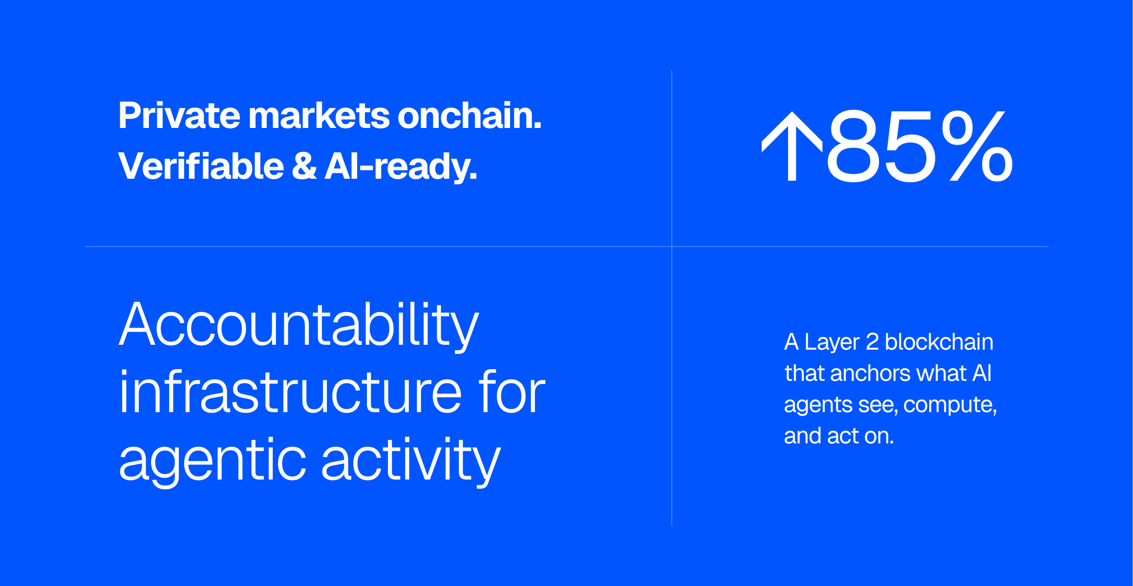
Image of brand logo incorrectly sized

Typography

Primary typeface

Geist embodies the design principles of simplicity, minimalism, and speed, drawing inspiration from the renowned Swiss design movement. With precision, clarity, and functionality at its core, Geist enhances the visual experience of developers and designers alike.
Typography

Fallback font

In some cases, we can not use our primary typeface. For example, collaborative workfiles will not show our primary typeface, unless all parties have that font installed. In those cases it is best to revert to a fallback font. For Inveniam, that would be Arial.
Imagery

Inveniam is the parent company which houses several different sub brands. The visual branding of these sub brands is always linked to the parent brand through the use of the framed mark, as well as the parent line underneath.

Imagery

Featured imagery

NVNM Chain’s brand images are AI-generated representations of digital sculptures. To create new images, we use these example images plus this prompt: Simple 3D object representing [...], floating mid-air against a black background. The object is white and the texture is smooth.
Imagery

Backdrops

The backdrops should always represent digital activity, streams or flows. We apply a layer of our primary blue on top to ensure it has the right hue of blue.


Orange gradient with shades of blue
Blue gradient with shades of orange
Gradient with shades of orange
Gradient with shades of blue

In use

Person sitting on floor working on laptop
Person sitting by window working on tablet
Person sitting on couch working on laptop
Person at standing desk working on laptop
Person sitting on couch working on laptop
Person at standing desk working on laptop

Brand Guide

NVNM Chain

This guide lays out the essential design standards that bring NVNM Chain’s brand to life. No matter your role or area of expertise, this guide gives you the tools to shape a clear and consistent brand experience in which every touchpoint reflects the trust and efficiency at the heart of NVNM Chain.

Messaging

How we describe NVNM Chain should not only resonate strongly with our audience—more importantly, it should be communicated consistently. The more unified and consistent our response to what NVNM Chain does, the more trusted we become by our audience.

Messaging

Principles

Keep it simple

Only use: NVNM ChainDo not use: NVNM, Inveniam Chain, nvnm chain, NVNM CHAIN

Capitalization ≠ engagement

In general, follow the Purdue OWL guidelines for using capitals.

Include everyone

Avoid financial and technical jargon and abbreviations. If they are needed, explain in full upon first use.

The eye is a stomach

It can get full. Keep writing short, concise and light.

Messaging

Taglines

Correct

Accountability infrastructure for agentic activity

Avoid

Accountability infrastructure for the agentic economy

Agentic accountability infrastructure

Messaging

Key messages

NVNM Chain is a shared, tamper-proof record that lets one company prove to another exactly what data it had, and when, without ever showing the data itself.

NVNM Chain is bidding to be the common standard for how companies prove the data they hand each other is genuine. Private-market deals first, then any place one party has to trust another party's data.

As companies hand more work to AI, NVNM Chain is the neutral ledger that records what each system was given and what it produced, so the other side can verify it instead of taking it on faith.

Logo

NVNM Chain is a business unit created by its parent company Inveniam. The wave mark is derived from Inveniam’s logo, linking NVNM Chain directly to the Inveniam family.

Image of brand logo incorrectly sized

Logo

Versions

Never use the mark by itself, unless for very restricted areas, and always in context of an NVNM Chain branded environment i.e. favicon for marketing website or avatar for social media profile.

We us our partner line ‘Part of Inveniam’ as much as we can. We omit it if legibility becomes an issue.

Image of brand logo incorrectly sized

primary

Image of brand logo incorrectly rotated

secondary

Logo

Color

There is a choice of 2: primary (white) or secondary (black with a blue glow).

As NVNM Chain is a dark brand, we prefer to use the white version as much as possible.

Overall, contrast is key when deciding on logo color use: logos must stand out against the backdrop.

Logo

Partnerships

Ideally, we’d only use the white version of our logo and the partner’s logo when visualizing a partnership.

If the partner’s branding demands a full colour logo, we use our logo in secondary color.

Size-wise, both logos should appear the same size optically.

Image of brand logo incorrectly colored

Logo

Incorrect Usage

To ensure we build the best relationship with our audiences, consistency is key. Not only in what we say, but also how we present ourselves visually. Simply follow the guidelines and you can’t go wrong.

Orange gradient with shades of blue

🚫 Don’t use multiple colors

Blue gradient with shades of orange

🚫 Don’t stack elements

Gradient with shades of orange

🚫 Don’t use framing

Gradient with shades of blue

🚫 Don’t distort/add effects

Color

NVNM Chain’s color palette reflects the interconnected undercurrents that ensure data flows in the right direction at the right pace. Primary blue is derived from the parent company brand palette. The Inveniam brand is bright and light, whereas NVNM Chain sits deeper and is therefore darker in color.

Color

Palette

Shades of primary blue enables us to create layered imagery, representing streams and flows.

Primary Blue

#0055ff

Black

#000000

Light Blue

#5f94ff

Navy

#001a50

Typography

Image of brand logo incorrectly sized

Typography

Primary typeface

Geist embodies the design principles of simplicity, minimalism, and speed, drawing inspiration from the renowned Swiss design movement. With precision, clarity, and functionality at its core, Geist enhances the visual experience of developers and designers alike.

Typography

Fallback font

In some cases, we can not use our primary typeface. For example, collaborative workfiles will not show our primary typeface, unless all parties have that font installed. In those cases it is best to revert to a fallback font. For Inveniam, that would be Arial.

Imagery

Inveniam is the parent company which houses several different sub brands. The visual branding of these sub brands is always linked to the parent brand through the use of the framed mark, as well as the parent line underneath.

Imagery

Featured imagery

NVNM Chain’s brand images are AI-generated representations of digital sculptures. To create new images, we use these example images plus this prompt: Simple 3D object representing [...], floating mid-air against a black background. The object is white and the texture is smooth.

Imagery

Backdrops

The backdrops should always represent digital activity, streams or flows. We apply a layer of our primary blue on top to ensure it has the right hue of blue.

Orange gradient with shades of blue
Blue gradient with shades of orange
Gradient with shades of orange
Gradient with shades of blue

In use

Person sitting on floor working on laptop
Person sitting by window working on tablet
Person sitting on couch working on laptop
Person at standing desk working on laptop
Person sitting on couch working on laptop
Person at standing desk working on laptop