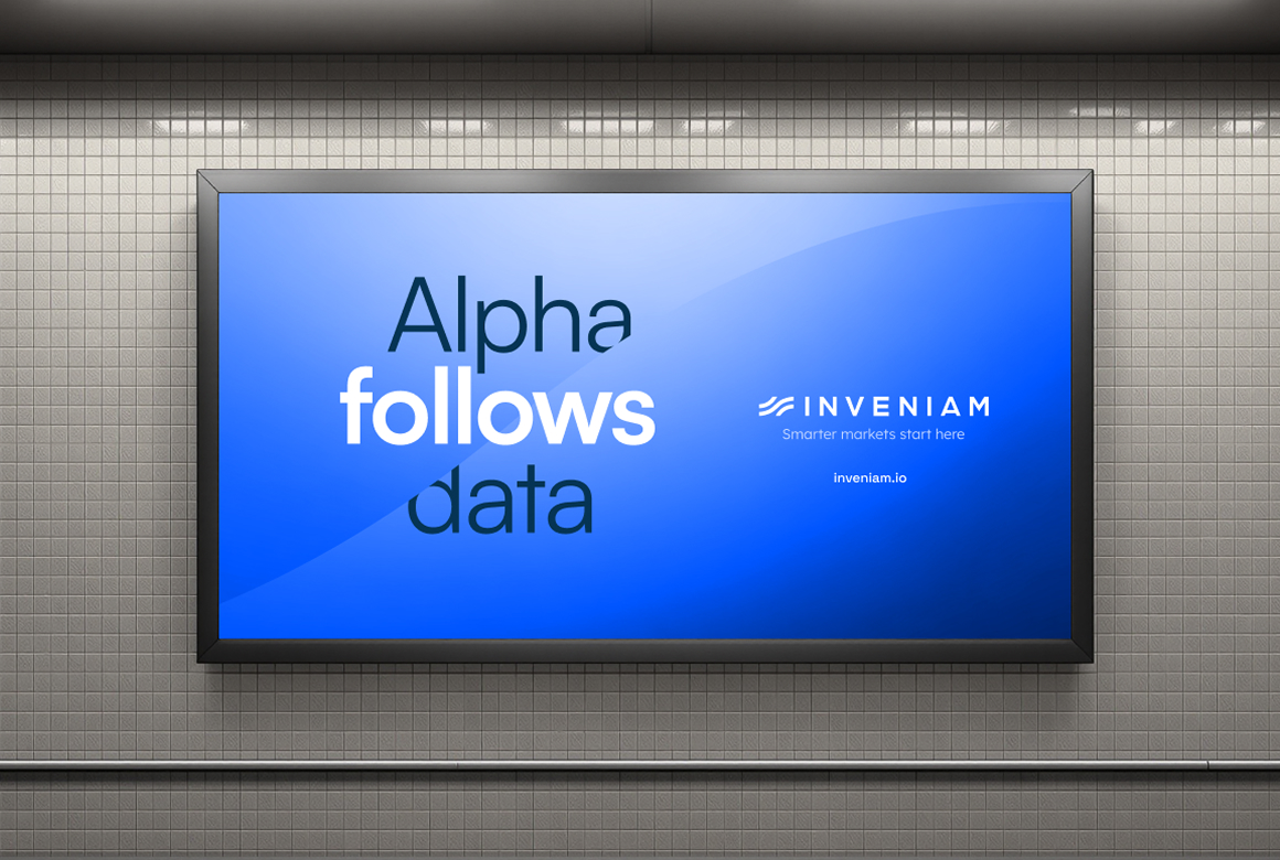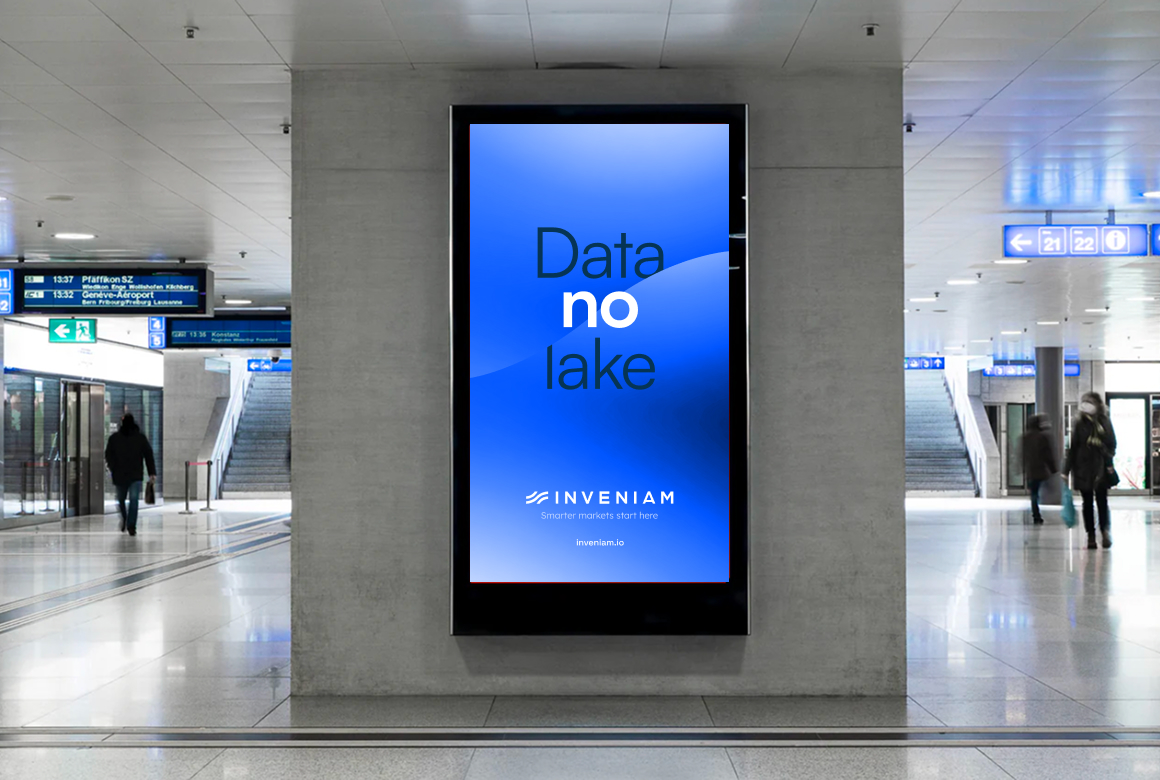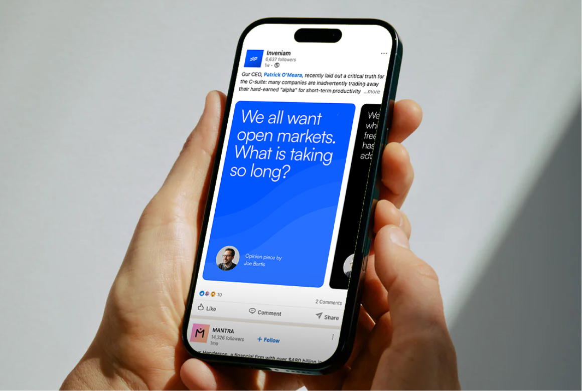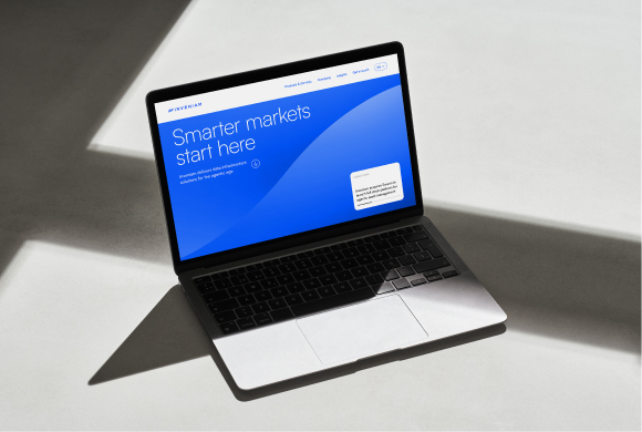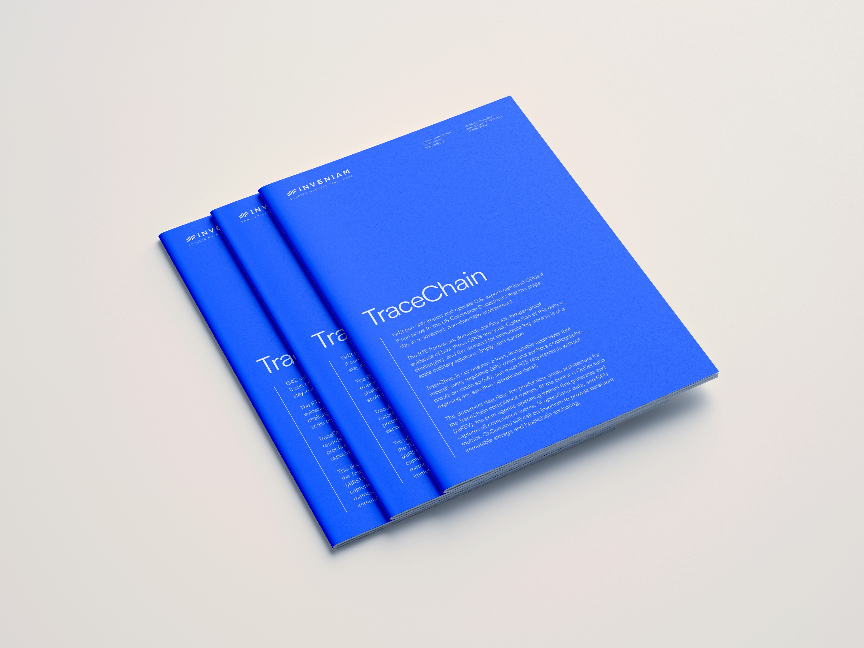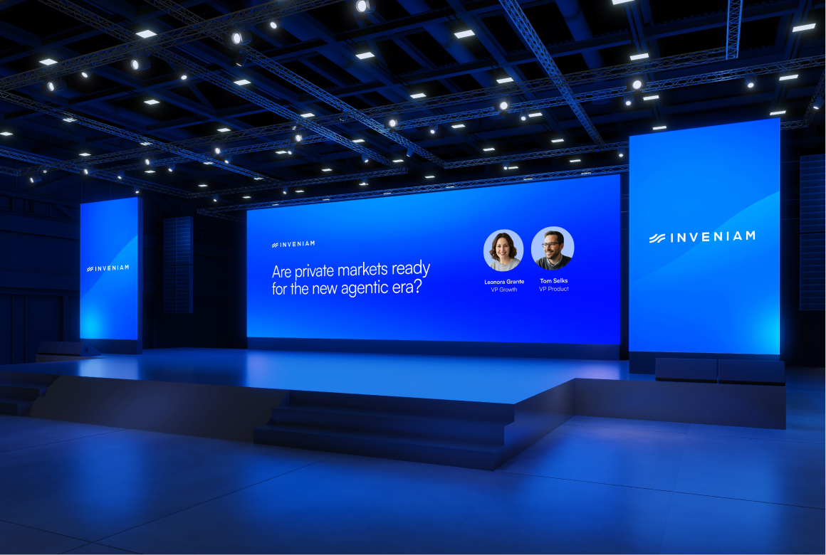
This guide lays out the essential design standards that bring Inveniam’s brand to life. No matter your role or area of expertise, this guide gives you the tools to shape a clear and consistent brand experience in which every touchpoint reflects the trust and efficiency at the heart of Inveniam.
Messaging
How we describe Inveniam should not only resonate strongly with our audience—more importantly, it should be communicated consistently. The more unified and consistent our response to what Inveniam does, the more trusted we become by our audience.
Messaging
Principles
Keep it simple
Whenever possible, only use “Inveniam”. Exceptions are official press releases in which we use “Inveniam Capital Partners” fully.
Capitalization ≠ engagement
In general, follow the Purdue OWL guidelines for using capitals.
Include everyone
Avoid financial and technical jargon and abbreviations. If they are needed, explain in full upon first use.
The eye is a stomach
It can get full. Keep writing short, concise and light.
Messaging
Taglines
Correct
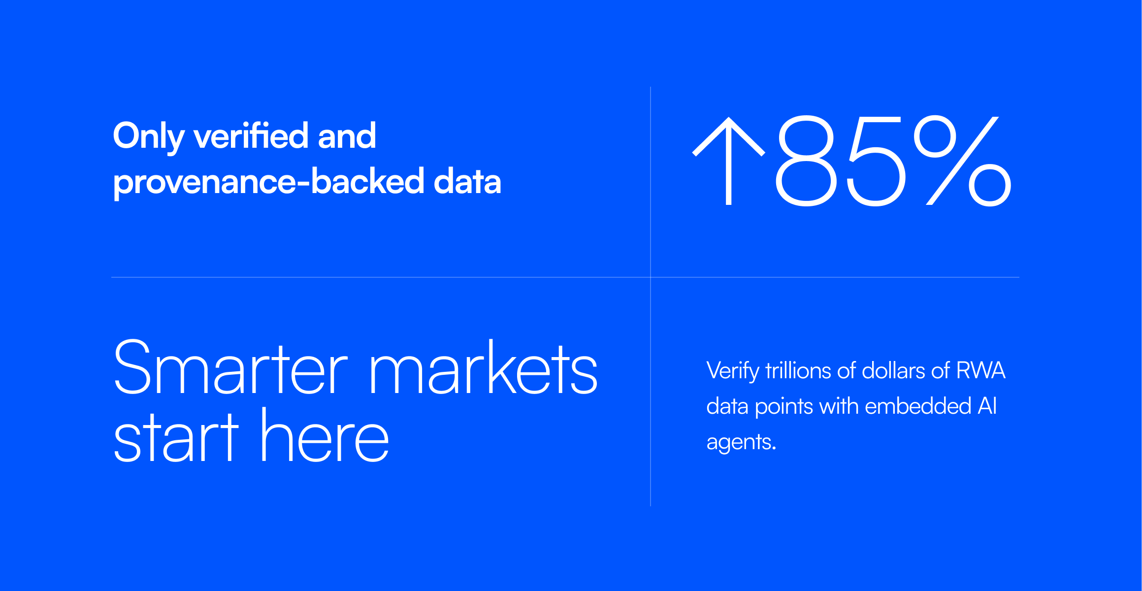
Smarter markets start here
Avoid
Smarter markets start with Inveniam
Smarter markets begin at Inveniam Capital Partners
Markets get smarter with Inveniam
Messaging
Key messages
Inveniam delivers data infrastructure solutions for private markets in the agentic age.
Inveniam helps organizations understand what's in their data, utilize it, and deliver it to tools on demand.
Inveniam brings its next-generation technologies to the entire private markets ecosystem.
Inveniam’s mission is to enable systematic trading of private market assets.
Logo
In the world of finance, mistakes happen—miscalculations, overlooked expenses, inefficiencies that silently erode profitability. Businesses lose money not because they aren’t earning, but because errors go unchecked.
Redo restores confidence in financial numbers.
Logo
Versions
Use the mark only within context of our own brand channels, i.e. website, printed brochures or social channels.
Once legibility starts to decrease, always swap the tagline version for the lockup version.

mark
lockup
tagline
Logo
Color
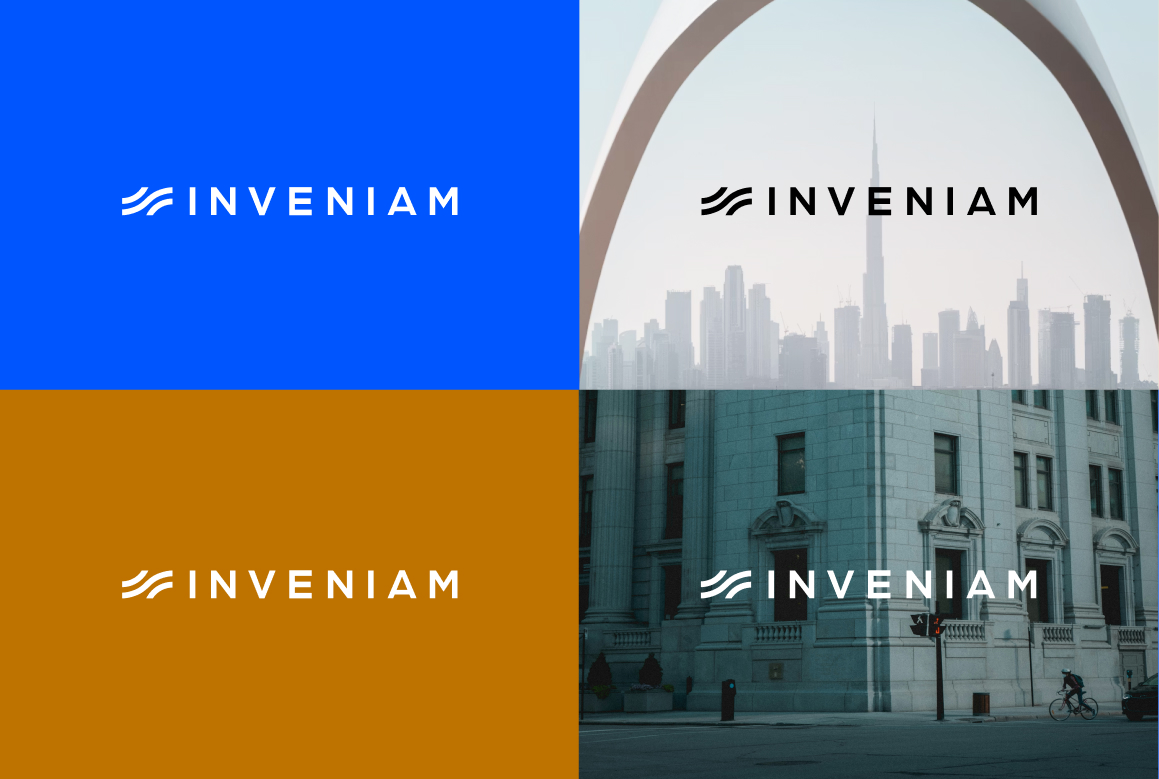
There is a choice of 3: blue, white or black.
We only use blue logos on white or very light grey backgrounds. We use black and white logos on any other colored backdrop.Overall, contrast is key when deciding on logo color use: logos must stand out against the backdrop.
Logo
Partnerships
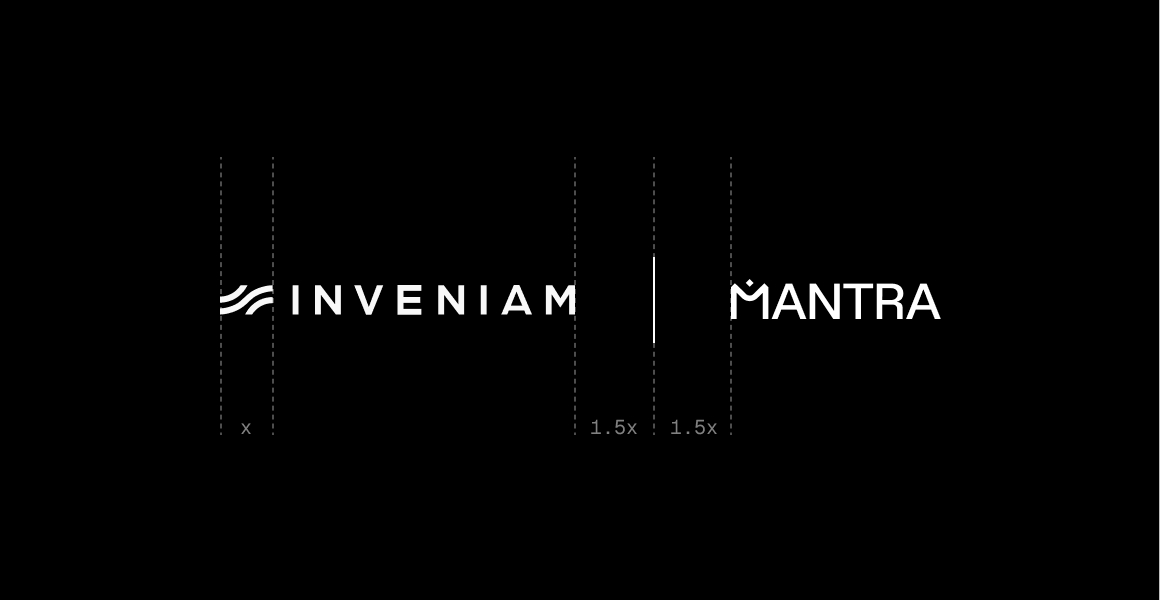
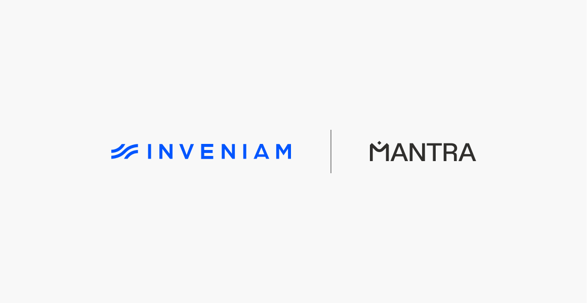
Ideally, we’d only use the white version of our logo and the partner’s logo when visualizing a partnership.
If the partner’s branding demands a full colour logo, we use a light grey backdrop so we can use our primary blue for Inveniam’s logo.
Size-wise, both logos should appear the same size optically.
Logo
Incorrect Usage
To ensure we build the best relationship with our audiences, consistency is key. Not only in what we say, but also how we present ourselves visually. Simply follow the guidelines and you can’t go wrong.
🚫 Don’t use multiple colors
🚫 Don’t stack elements
🚫 Don’t use framing
🚫 Don’t distort/add effects
Color
Inveniam’s color palette is based on the cool and calming colors of clear water, evoking a sense of clarity and trust.We also apply these colors to our backdrop gradients, resembling the various depths of our collective data.
Logo
Palette
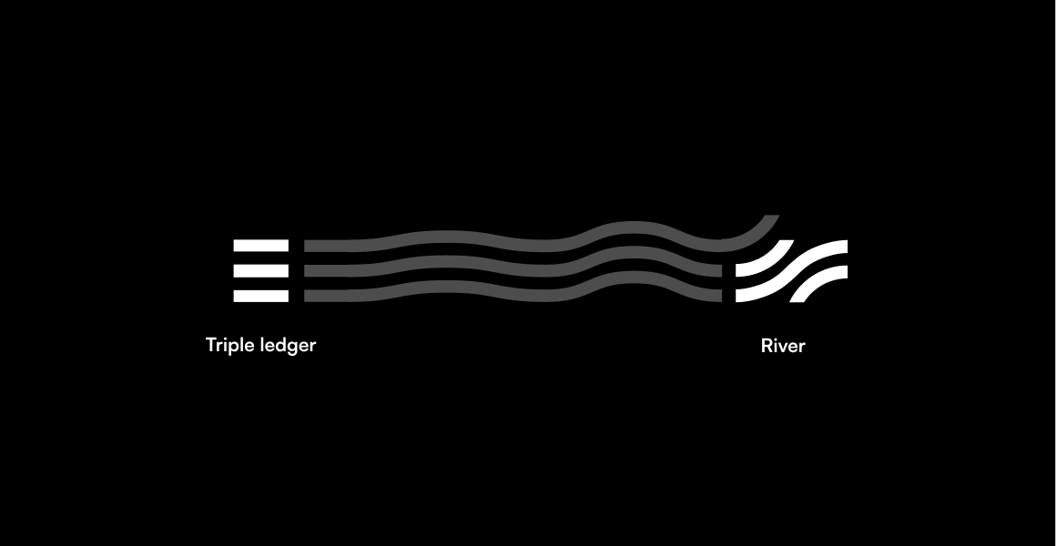
Our blue colors represent the river of data and the beige hues are the rocks and banks that guide the river along.
Inveniam Blue
#0055ff
Lightest Blue
#edf6ff
Light Blue
#8bcdff
Navy
#002b82
Beige 01
#1E3D59
Beige 02
#efe4d0
Beige 03
#e2d5bd
Beige 04
#dbc9a9
Logo
Gradients
We use gradients in backdrops. For example behind our signature wave, in email hero imagery or social visuals. We use the colors from our palette to create these gradients.

Logo
Photography
Brand photography is warm and features various hues of blue, black and brown.

Typography
Typography
Primary typeface
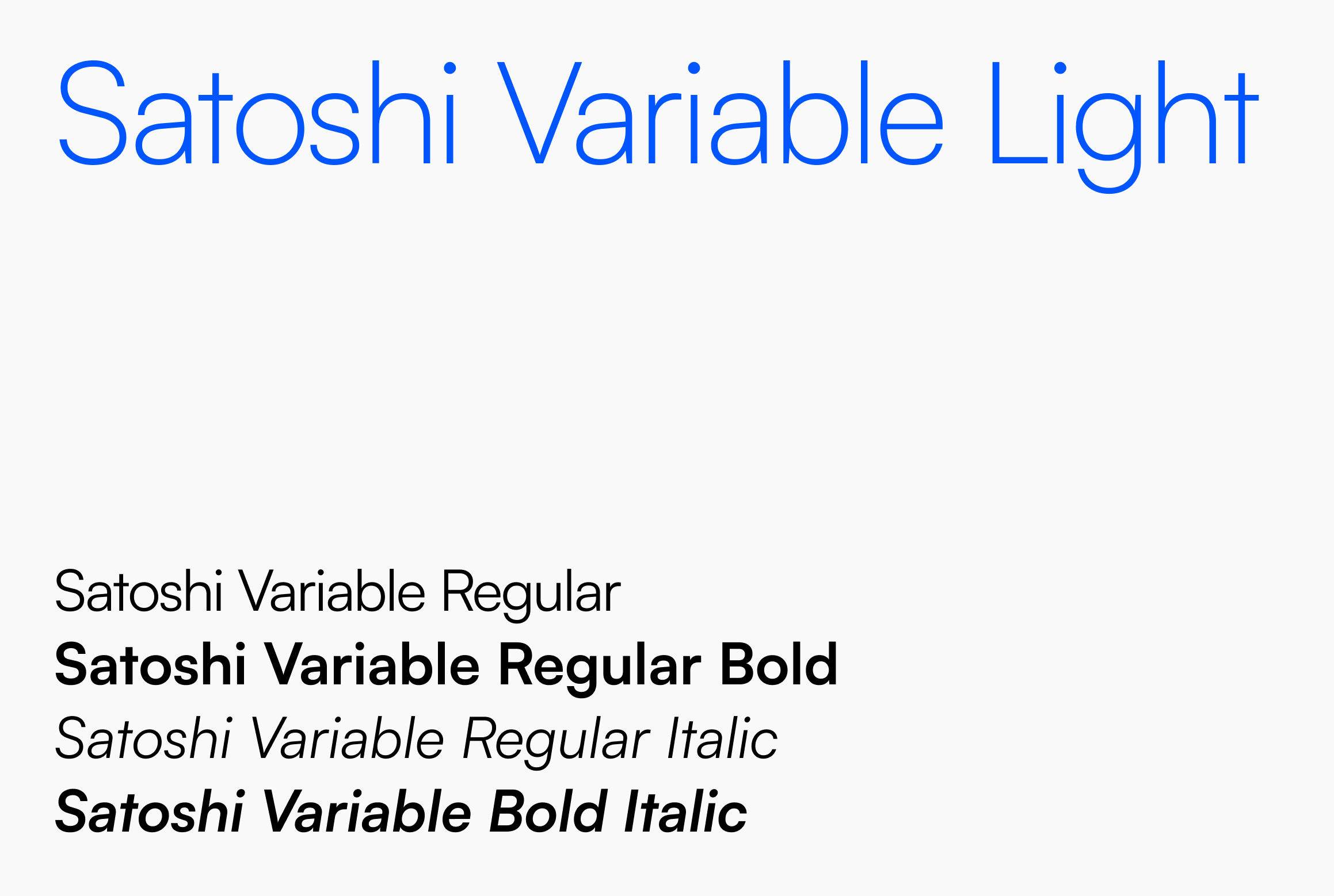
Satoshi is a modernist sans serif typeface. Its design combines typically grotesk-style letterforms, with some characters that are quite geometrically-designed: a typeface that is grounded and clear.
Typography
Fallback font
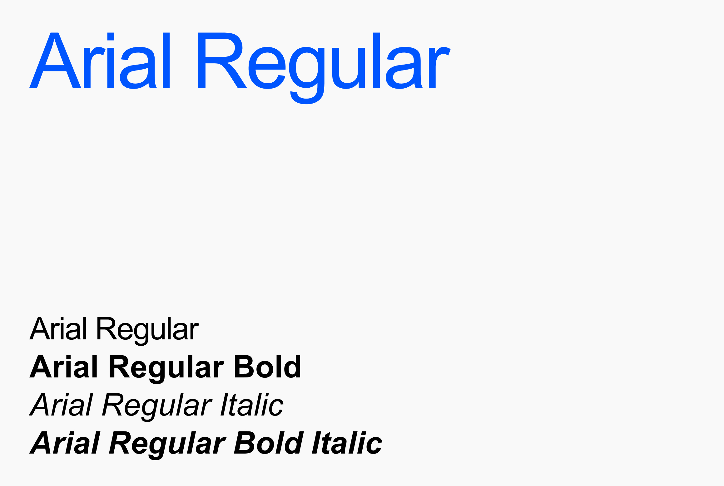
In some cases, we can not use our primary typeface. For example, collaborative workfiles will not show our primary typeface, unless all parties have that font installed. In those cases it is best to revert to a fallback font. For Inveniam, that would be Arial.
Sub brands
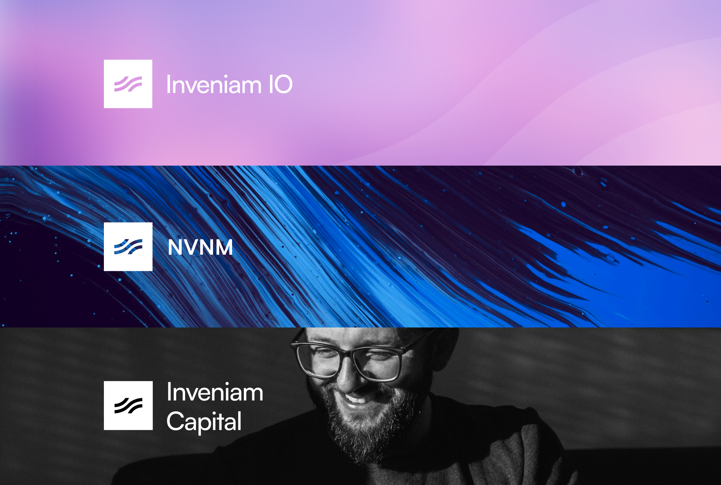
Inveniam is the parent company which houses several different sub brands. The visual branding of these sub brands is always linked to the parent brand through the use of the framed mark, as well as the parent line underneath.
Sub brands
Parent line
Although the sub brands give a visual nod to the parent brand, we created the parent line ‘Part of Inveniam’ to strengthen that link even more.Any sub brand logo should always be accompanied by our parent line. Whenever possible, this line should link to the parent marketing website www.inveniam.io.
Sub brands
Creating new sub brands
When creating new sub brands, the only set condition is to use the framed mark and typeface (Satoshi Variable) for the wordmark, to maintain the family resemblance. With everything else—color, typeface, photography—there is complete freedom.
In use